Posted on Thu 21 Jun 2012
Lunchtime Talk: Colour trend visualisation
Arthur Buxton studied illustration at UWE and now works as a print technician in the digital print area of UWE and is an artist in residence at Centre of Fine Print Research (CFPR)Arthur composes visualisations of colours trends using open source sampling tools that create a new way of looking at…
Arthur Buxton studied illustration at UWE and now works as a print technician in the digital print area of UWE and is an artist in residence at Centre of Fine Print Research (CFPR)
Arthur composes visualisations of colours trends using open source sampling tools that create a new way of looking at colour schemes. Arthur removes the figurative and compositional elements from an image, leaving behind the colour, allowing you to appreciate the palate and its harmonies more objectively. Using colour extraction software and adobe illustrator, Arthur has created a number of charts that reveal a surprising amount of information, imparted by the colours alone.
Arthur reinterpreted the works of famous artists such as Monet and Van Gough spanning across a decade and represented them in pie charts. The charts offer a concise way to see how distinctive each artists’ signature palates can be, as well as revealing the contrast in each artists’ work and how they have developed through different artistics movements or instigated a particular path, for example Gaugin relocated to Tahiti which reflected his later work, as the colours moved from a traditional European palate to more tropical colours.
Arthur made a clear choice to use household names, as he wanted his work to remain inclusive and recognisable to a wide audience. He sent his work to his favourite blog Boing Boing and it was posted, which gave Arthur lots of exposure, he posted his charts as anonymous artists and posed the challenge to guess who they were, making his work interactive, he then released the answers on his own blog which gave people an incentive to find out more about him and his work.
Arthur has always been interested in simplifying complex images down to their constituent parts, inspired by artists like Julian Opie, who contributed to Arthur’s practice, he quotes “Words are the language of the mind and they are learned but passing colours and shade are the language of the eye” they are innate, they are not a written language, we can’t learn them, they can be read without any teaching.
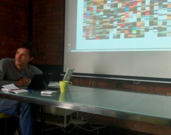
Vogue Covers Covered maps the Vogue publications of Britain, Paris, USA and Italy. Within each piece the small bar charts (measuring 2.4 by 2.9 cm at 1:10 scale to the originals) show the five most prominent colours used on the front covers of Vogue proportionally in an individual image. Each column is a year starting with September (the beginning of the fashion season) working down to October at the bottom. The strips run from 1981 on the right working across to 2011 on the left. Aside from seasonality and long-term changes in the palette, more concrete data become apparent, for example, the ‘Paris vogue covers 1981 - 2011’ a sudden change in tones occur in late 1987. The data visualisation colour time-lines were produced in conjunction with the CFPR and will be on shown throughout the UK this year starting in Northern Print, Newcastle.
Arthur is interesting in working with new collaborators, particularly those with technical expertise to develop future projects. Visit http://www.arthurbuxton.com/ to find out more and to get in touch.