
Using iterative development to redesign our exhibit pages
Posted on Tue 7 March 2017
A few months ago I had the same fear when tasked with redesigning exhibit pages on watershed.co.uk. They're our highest traffic pages and they have a complex information architecture. I'm going to share how a process of iterative development got us there steadily, and explain why we've adopted it for solving most other user experience problems we face in the Online team at Watershed. I'll also detail some of the tools and techniques we used along the way.
I've sat down to write this, my first ever blog post, and naturally I'm a bit scared. I've never written one before and the pressure of achieving a slick, finished product is intimidating. But is it useful to start worrying about creating a finished product before I've even begun writing?
A few months ago I had the same fear when tasked with redesigning exhibit pages on watershed.co.uk. They're our highest traffic pages and they have a complex information architecture. I'm going to share how a process of iterative development got us there steadily, and explain why we've adopted it for solving most other user experience problems we face in the Online team at Watershed. I'll also detail some of the tools and techniques we used along the way.
Iterative development means baby steps. Establish a goal, make a small change, measure its effect in achieving that goal, and repeat. It's a longer process than a one-shot redesign but I find it more powerful in two ways:
- focussing on smaller sub-problems keeps you on track towards the target, instead of getting consumed by the bigger challenge
- it results in justified solutions which really meet users' needs.
And coming back to my fear of writing, the same advantages apply with creating this blog post! Through editing and refining it a few times, I've reached a point where I'm happy with it.
The challenge
When people visit Watershed for a film screening, the chances are it’s part of a season, festival or curatorial theme. It's exciting to work in an organisation with such a strong curation over its programme, but sometimes I find myself posed with a UX conundrum: how do we present all the inter-linked information on one page without swamping the user?
This question became an important one last year during Cinema Rediscovered. The festival had a large programme, including two seasons, a bunch of films, one-off screenings, and articles written by the festival's curators. In the middle was the Andrei Tarkovsky film Nostalgia, which we screened as part of a season celebrating the director's work.
On the page we needed to present and balance many things:
- information about the film (director, certificate, blurb, etc.)
- screening times
- the trailer
- the Sculpting Time season
- the Cinema Rediscovered festival (or 'theme')
- any related articles written by the curators
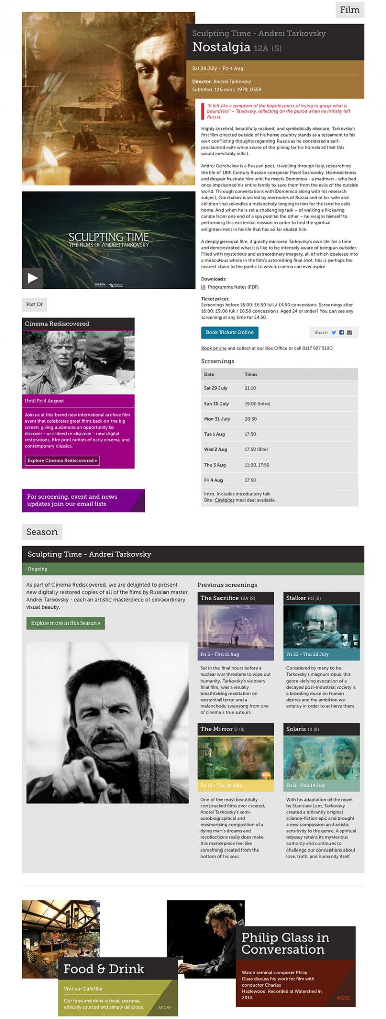
Our initial effort at presenting a film that's part of a season that's part of a festival
The page had become cluttered, which was compromising the user experience. We needed to simplify the layout and balance it's components, prioritising the features that users need most.
Identify the user needs
The first step was to go back to the drawing board and think up some user stories. These are assumptions about what users require from a page, which inform its functionality by empathising with the people who will actually use it. This article on UXPin gives more detail on how to approach writing good user stories.
The strongest story that emerged for this page was the need to book a ticket for a screening. Identifying this as a primary need for the user meant we had a clear goal to work towards achieving.
Our current design was not prioritising this need as the booking information was sat quite far down the page, below the copy.
Unsure it'll work? Try all versions
To increase its visibility, we moved the screening calendar up to where the trailer was. In doing this, we thought about hiding the trailer in a modal window which was revealed by clicking a 'Play Trailer' button. However, we weren't sure if the button would be too concealed and not easy for users to find.
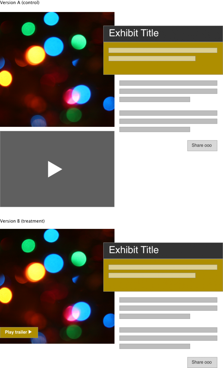
Wireframes of the two designs we split tested, created using Sketch app.
To find out, we split tested two versions of the page and measured the difference in their performance. This is easy using Google Analytics Experiments, which allows you to compare the conversion rate of different versions of a page against a goal.
We compared the number of views of the trailer video on the original page against the number of clicks on the button in the new version. We found that there was no significant difference. This verified that the button wasn't having a negative impact on use of the trailer. We had now also freed up some much-needed space on the page!
Iterate, and iterate, and...
When addressing more detailed areas of the interface, like the screening calendar itself, we planned small incremental changes, considered their implications, and repeated until we felt the interface had been refined to a point where it was genuinely usable.
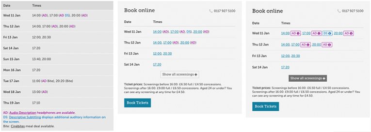
A couple of iterations of the screening calendar
Time for a sanity check
At some point during the process it's helpful to step back and revisit the initial goals you set out to achieve. These should align with users' core needs of the page. It's important to know when to stop and do this before getting too carried away iterating!

We found that secondary content wasn't cohesive or balanced in its presentation. This is because we were struggling to present a complex hierarchy of information. This resulted in confusing the user about something they don't actually care about. The user is much more interested in content related to what they're viewing. Their priority isn't understanding how we've structured our programme.
So with this in mind, we gave it another go.
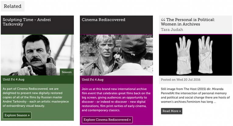 A new presentation for related content
This version allows us to present any related content without worrying about its place in a hierarchy. Above we have the season, the festival and some relevant editorial sat alongside each other, instead of being spread out indifferent sections. We reached this result by looking back to a user need and translating it into a feature. And it's a lot simpler.
Taking it step by step
At this point we've reached a stage where the interface is simple, flexible and satisfies our users' main needs. We'd never have got there by trying to tackle the whole page design at once. The journey isn't over yet: an interface is always imperfect and can always be improved, but it's also important to recognise good enough.
The tools and techniques described in this post enabled us to identify goals for a page design that are user-focussed, and enabled us to work incrementally towards achieving those goals through iteration and measurement. This is the real power of iterative development in practice.
I hope this post goes a way to showing off the power of using iterative development to tackle a big problem. Hopefully the techniques we used might be useful for someone in a similar dilemma. Happy iterating!
Also published on Medium.