James Harrison
on Wed 18 July 2018The Look of Mike Hodges
Posted on Wed 18 July 2018
Revisiting the films of Bristol-born Mike Hodges, South West Silents' co-founder and co-curator James Harrison reflects on the colour and design that set a look and defined a decade of filmmaking in the director's screen career.
There are a number of reasons why the films, Get Carter (Sat 28 July, 17:40), Pulp (Fri 27 July, 11:10), The Terminal Man (Sat 28 July, 23:30) and Flash Gordon (Fri 27 July, 20:15) make up this very special strand celebrating the work of Bristol born film director, Mike Hodges. One key reason was that all four films were made over the course of a ten-year period of Hodges’ film career, showcasing the range of work he produces as a film director. The strand consists of; a gangster film, a comedy, science fiction (or is it really science fact?) and a classic space opera.
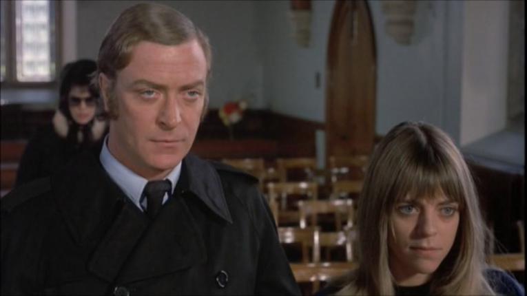
Hodges also has an impeccable eye for detail rendering the overall look and presentation of his films as striking. This is something I picked up on time and again when I recently returned to his body of work. In particular, it is his manipulation of the use of colour from one bookended film to the other in this strand that stood out, from the bleak realism found in Get Carter to the rich surrealism of Flash Gordon, with everything in between appearing in Pulp and The Terminal Man.
Get Carter (1971)
Encrusted with the staleness of a modern Britain trying to pull itself out of a post-war world, Get Carter has a fantastic sense of visual realism that lends it an air of meanness, which, in turn, enhances the depiction of Newcastle (and the North) that the likes of characters Jack Carter, Eric Paice and Cyril Kinnear would have surfaced from.
I was lucky enough to speak to the film’s cinematographer, Wolfgang Suschitzky, just before he passed away in October 2016. I was working on a BBC documentary in Bristol for BBC Four about the National Coal Board Film Unit (Timeshift: When King was Coal), and was able to make contact with Wolfgang rather early in the production. We discussed, over the phone, his experiences working on NCB films and, as the film nerd that I am, I couldn’t help but ask him about his work on Get Carter, too.
Suschitzky’s cinematography for the NCB was very much Carter-esque, in rough and ready ways. By chance, one thing he did mention during our discussion was that his work on Ken Hughes’ The Small World of Sammy Lee (1963) was one of the key reasons Hodges thought he would be the right person for the job, despite his NCB work and The Small World of Sammy Lee being shot in black and white. It was the essence of realism, though, found in both projects, that Hodges liked and that can be seen in Get Carter.
Pulp (1972)
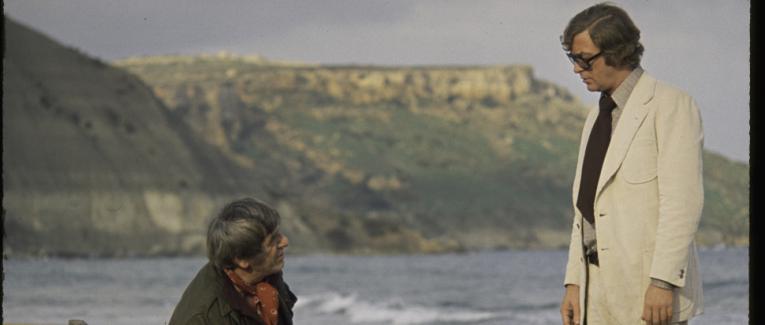
While, on the face of it, Pulp could be a rehash of a number of tropes covered in Get Carter from gangsters and corruption at the top to the charisma of its lead actor, Michael Caine, it is most certainly different from Hodges’ debut. From the outset, while Carter has hints of black comedy throughout, Pulp is much closer to an all-out comedy, with the occasional bit of violence thrown in. Hodges also wanted the look of Pulp to be totally different, too. Gone were the gritty streets of Newcastle, a beautiful Italian landscape in its place (although the film was shot in Malta). Gone, too were his Carter production team, and in their place a new Cinematographer (Ousama Rawi), Production Designer (Pat Downing), Costume Designer (Git Magrinni) and Editor (John Glen).
The use of colour within Pulp is particularly intriguing: there is almost a brown tint throughout the film, some fifty shades of brown, infused with the occasional faded hues of creams and blues, all of which serves to make us feel a sense of unease in watching. Perhaps the aesthetically designed unease is Hodges’ own love letter to the classic Hollywood films that he grew up on? After all, Michael Caine’s Mickey Kling is a pulp writer, influenced by the classic pulp writers and Hollywood B-movies of the past.
Caine is also surrounded by classic Hollywood stars; Mickey Rooney playing the ‘over the hill ex-noir star Preston Gilbert’ and the irreplaceable Lizabeth Scott, who had starred in so many classic films, a lot being noir and gangster films, not to mention classic Hollywood star Lionel Stander. These elements beg the question: is Pulp Mike Hodges’ own nod to the films he grew up with as a child? See them at Cinema Rediscovered and you can decide.
The Terminal Man (1974)
In January 1973 Hodges found himself flying to Hollywood for his third film project, an adaptation of Michael Crichton’s 1972 bestselling novel, The Terminal Man. A story that questions the ethics and dangers of mind control - an incredibly cold and complicated subject to take on, and yet, Hodges was more than confident that he would be able to adapt it successfully for the big screen.
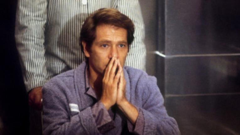
From an early stage in the production, Hodges wanted to give the film a sense of loneliness. He wanted to give the sense that the character Harry Benson (George Segal) was very much on his own; physically but also mentally. All of which would be set in front of the American urban landscape of Los Angeles.
“My inspiration came from the American painter Edward Hopper who was relatively unknown in the UK at the time. . . Something made me pick up this voluminous book of his paintings. . . I opened it and there was my film. There was the sheer loneliness of urban American framed on every page. I can remember at that moment deciding to strip my film down to match the loneliness that Hopper had captured. I still have that book.” (Davies; 2002; page 77).
Hodges turned to both his production designer Fred Hartman and cinematographer Richard H. Kline to discuss his plans. If anything, Hodges really wanted to shoot The Terminal Man in black and white, which would simplify and amplify the sense of loneliness. Knowing that the Studio, Warner Brothers, wouldn’t agree to such an idea, he asked Kline to bleed the primary colours out of the film and keep the production design and set colours to a minimum, using different shades of white, grey and black, with the odd bit of colour thrown in for certain, symbolic scenes.
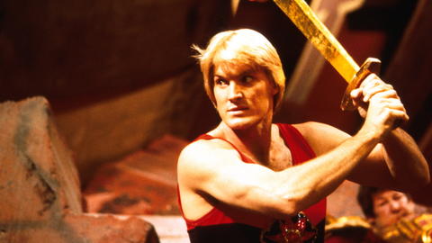
Flash Gordon (1980)
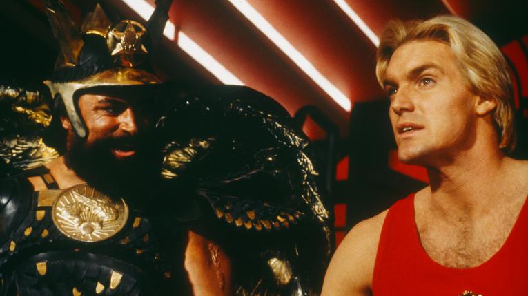
Where would Flash Gordon be without colour? Even in the early days of working on the film (after replacing Nicolas Roeg) Hodges wanted the film to scream out with colour. Working alongside Federico Fellini and Pier Paolo Pasolini’s regular production and costume designer Danilo Donati, Hodges took the fun and adventure found within the original 1930s comic strip and exploded it onto the big screen.
There is a lot to love in Flash Gordon; the costumes by Donati are probably the best you will ever see when it comes to over the top design for a science fiction film, and the set designs push the boundaries of fantasy. In fact, certain set designs - especially exterior scenes on the planet Mongo - scream out the pioneering work of early cinema pioneer, Georges Méliès. Add to this the Queen soundtrack and Flash Gordon is a cinematic experience like no other. For modern day superhero fans it is no surprise, then, that Flash Gordon was also a major influence on director Taika Waititi and his own comic book adaptation, Thor: Ragnarok (2017).
Written by James Harrison (South West Silents).
Pulp (Fri 27 July, 11:10), Get Carter (Sat 28 July, 17:40) and The Terminal Man (Sat 28 July, 23:30) screen as part of Cinema Rediscovered.
Flash Gordon (Fri 27 July, 20:15) screens on Museum Square as the first of our Cinema Rediscovered outdoor screenings.
For more information on our upcoming screenings of Mike Hodges' work, as a part of our UNESCO City of Film focus at Cinema Rediscovered, head here.
